Premium RTD Launch Key Visual + Campaign System
Turning “Ready When You Are” into a premium product-first refreshment signal.
A product-first Canadian launch campaign built around an opened bottle, active carbonation, chilled glass, and Absolut recognition.
Challenge
Bring “Ready When You Are” to life for the Canadian launch of Absolut’s first RTD. In a crowded category, the work needed to avoid generic lifestyle imagery and sweetness cues while positioning the vodka-based spirit tonic as premium, adult, less sweet, and unmistakably Absolut.
Insight
For a premium RTD, “ready” should be felt before it is read.
A removed cap, active carbonation, chilled glass, and condensation make the product feel freshly opened and ready to drink—without relying on lifestyle imagery.
Idea
Make the bottle the launch moment.
Present Absolut CUT as a cold, just-opened object, with the product held firmly as the hero. “Ready When You Are” becomes a visible product state rather than simply a headline.
Role – Senior Art Director
Original launch work:
Developed the visual concept from the client-supplied line “Ready When You Are” and led the work through approvals, photography, retouching, layout, production and final delivery. Presented directly to the client and commissioned and directed photography and digital retouching.
Contemporary self-initiated adaptation:
Extended the key visual into a modular system spanning vertical motion, hero crops, safe-zone logic, display formats, and OOH.
Project Snapshot
Client: Labatt Breweries
Brand: Absolut CUT
Brand: Absolut CUT
Agency: Echo Advertising | Photography: Garth Grosjean | Retouching: Brett Simms Imaging
Category: Beverage alcohol, RTD, premium spirit tonic
Product: Absolut Vodka + sparkling water + citrus extracts; 7% alc./vol.
Campaign line: Ready When You Are
Original channels: OOH, print, retail POS, on-premise
Current adaptation: Vertical social, display, modular crops, and OOH
Audience: Adult drinkers seeking a less-sweet, more sophisticated RTD
Category: Beverage alcohol, RTD, premium spirit tonic
Product: Absolut Vodka + sparkling water + citrus extracts; 7% alc./vol.
Campaign line: Ready When You Are
Original channels: OOH, print, retail POS, on-premise
Current adaptation: Vertical social, display, modular crops, and OOH
Audience: Adult drinkers seeking a less-sweet, more sophisticated RTD
Launch Key Visual
Product-first restraint for a premium RTD.
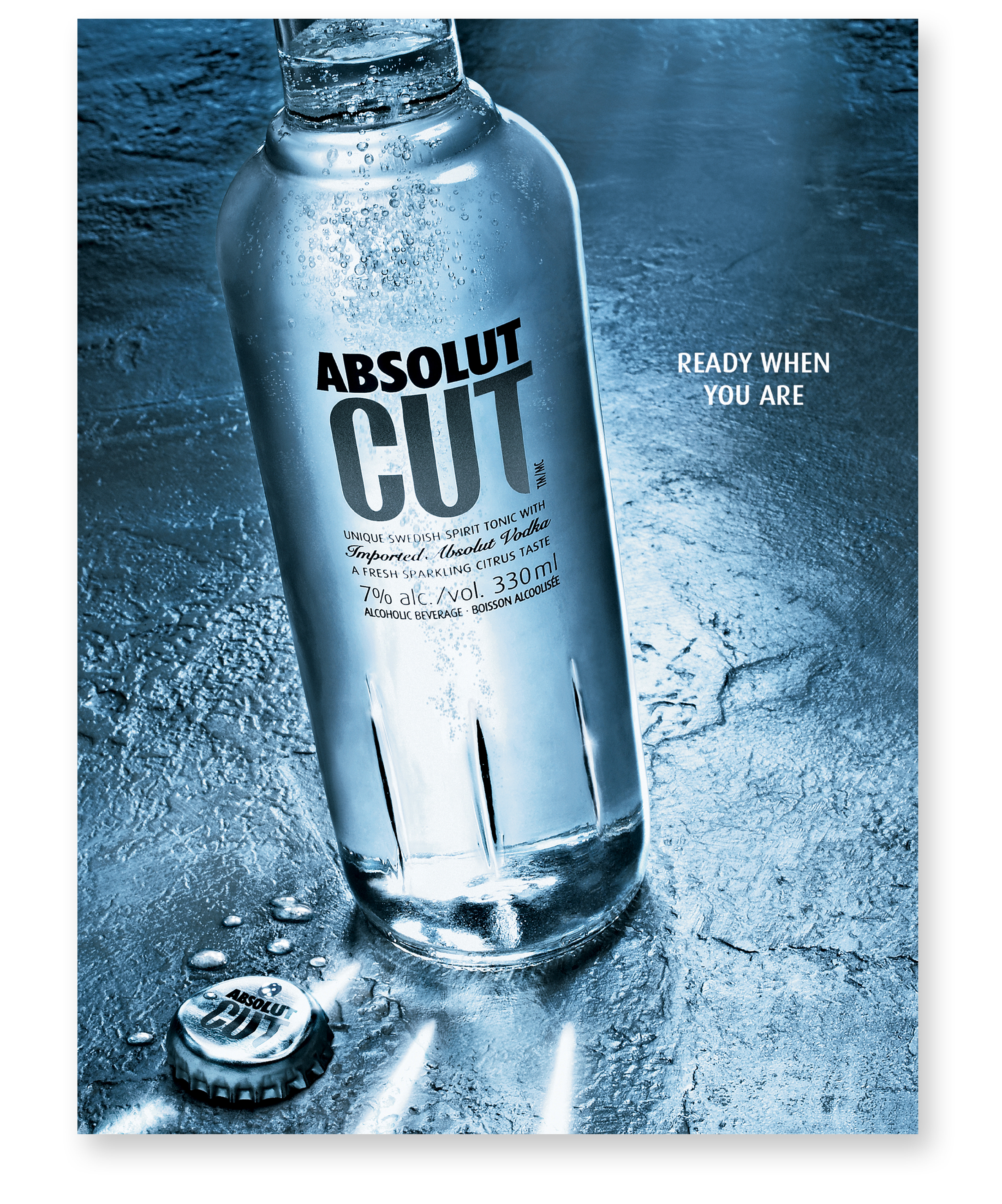
The launch visual uses a restrained composition, tactile surface treatment, and recognizable bottle silhouette to establish CUT as a premium, product-led RTD.
Visual Platform
Cold. Opened. Sparkling.
Four sensory cues make “Ready When You Are” visible before the headline is read.
Cap-off readiness - The removed cap signals that the bottle has just been opened.
Carbonation bloom - Active bubbles create energy and immediate freshness.
Chilled glass - Condensation and refracted highlights communicate temperature and tactility.
Raking light and embossed detail - Raking light reveals CUT's distinctive embossed glass detailing, with refracted highlights carried across the wet surface and discarded cap.
Creative Direction Decisions
Lead with the product
Hold the bottle as the central subject to establish immediate Absolut recognition and avoid interchangeable RTD category imagery.
Make readiness unmistakable
Combine product state and sensory cues so the campaign communicates “just opened” before the copy is read.
Build a premium reading order
Let the product and brand read first, followed by the campaign line, supporting information, and legal copy.
Protect the idea across formats
Use crop rules, safe zones, type placement, and legal positioning to preserve the image across social, display, and OOH.
Motion-First Key Visual Sequence
From sensory hook to campaign lockup.
The contemporary 9:16 sequence develops a reveal structure first explored in motion proposals for the original campaign.
Original Motion Proposal
Projected laser-animation concept
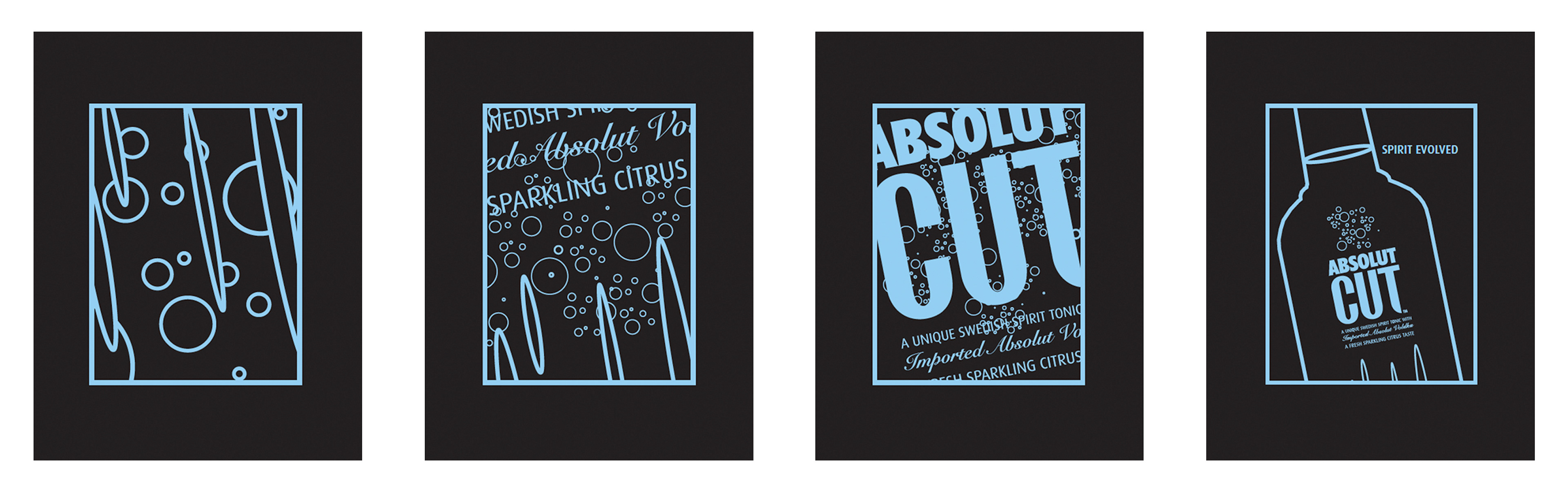
Context: During the original campaign, I proposed both lenticular and projected laser-animation executions that would reveal the product through carbonation, typography and bottle details before resolving into the final key visual. Neither execution was produced. The self-initiated adaptation below revisits and more fully realizes that reveal structure using contemporary motion capabilities.
Contemporary Motion Adaptation
Self-initiated 9:16 social sequence
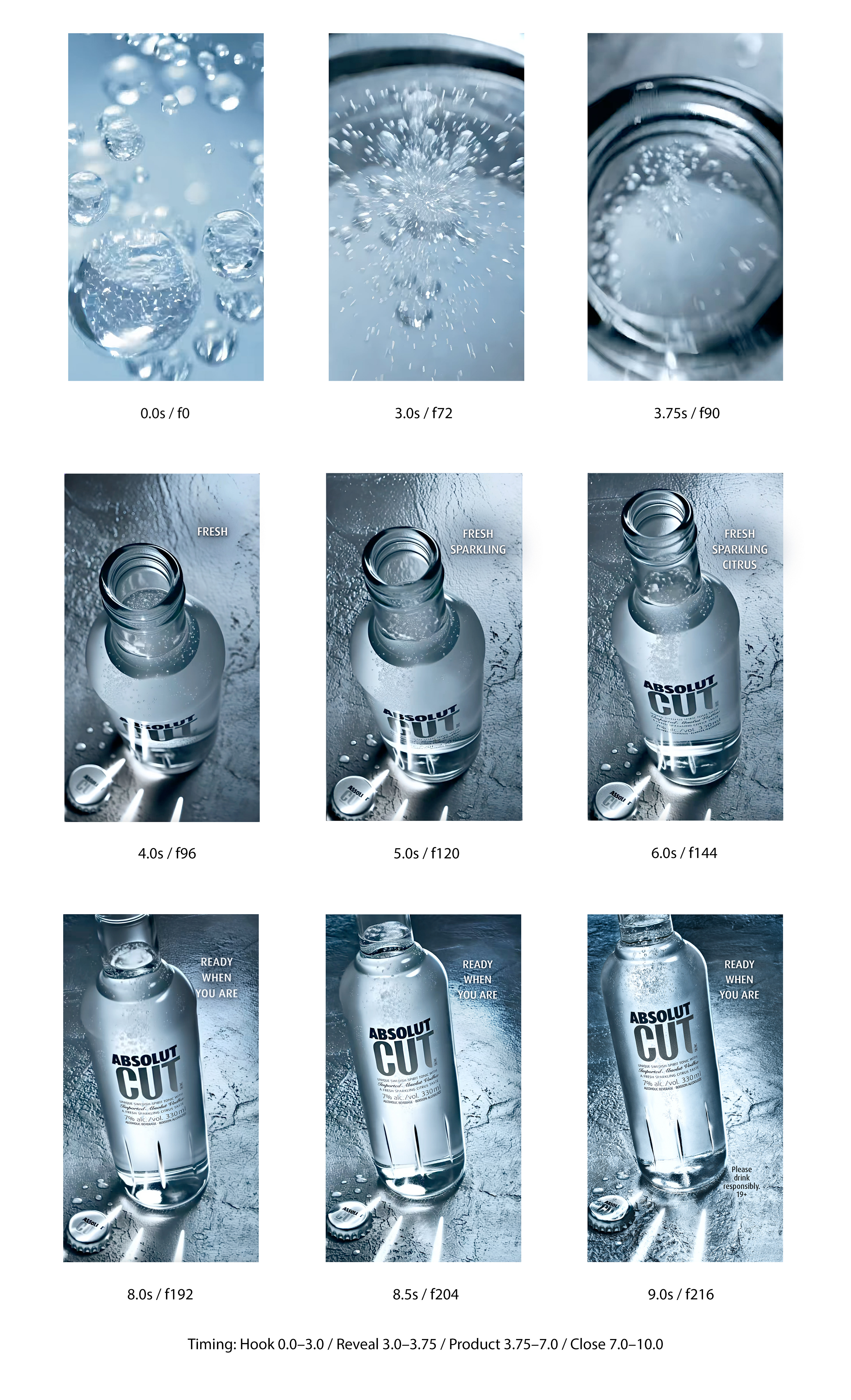
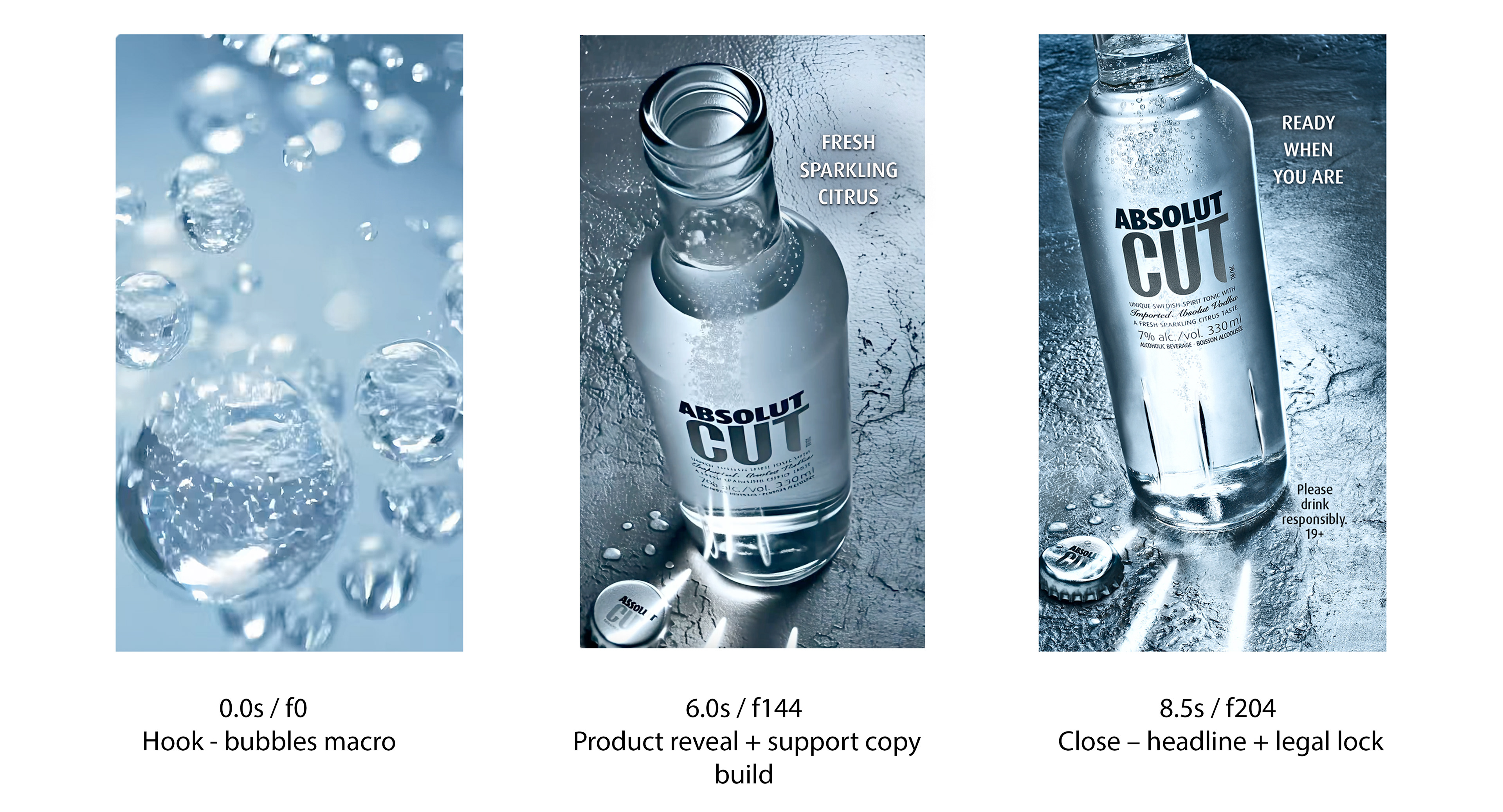
The sequence translates the still image into a timed reveal. Abstract bubbles first create a sensory hook, then resolve into the bottle mouth, cap-off product state, and final campaign lockup. Each stage adds information without introducing a separate creative idea.
Sequence Logic
Hook: Abstract carbonation creates intrigue.
Reveal: The bottle mouth establishes product context.
Product: The pack and removed cap clarify the campaign state.
Close: The bottle, headline, and legal copy form the final lockup.
Reveal: The bottle mouth establishes product context.
Product: The pack and removed cap clarify the campaign state.
Close: The bottle, headline, and legal copy form the final lockup.
Reel Storyboard (9 Frames)
Vertical social (9:16) — Stories/Reels/TikTok-ready
Vertical social (9:16) — Stories/Reels/TikTok-ready
Key Motion Frames
Three frames capture the sequence’s essential communication beats.
Three frames capture the sequence’s essential communication beats.
Campaign System Rules — 9:16 Social Toolkit
The safe-zone system protects the bottle, CUT mark, campaign line, and legal copy from platform overlays. The product occupies the central zone, with supporting type held to the right and legal information kept within the lower safe region.
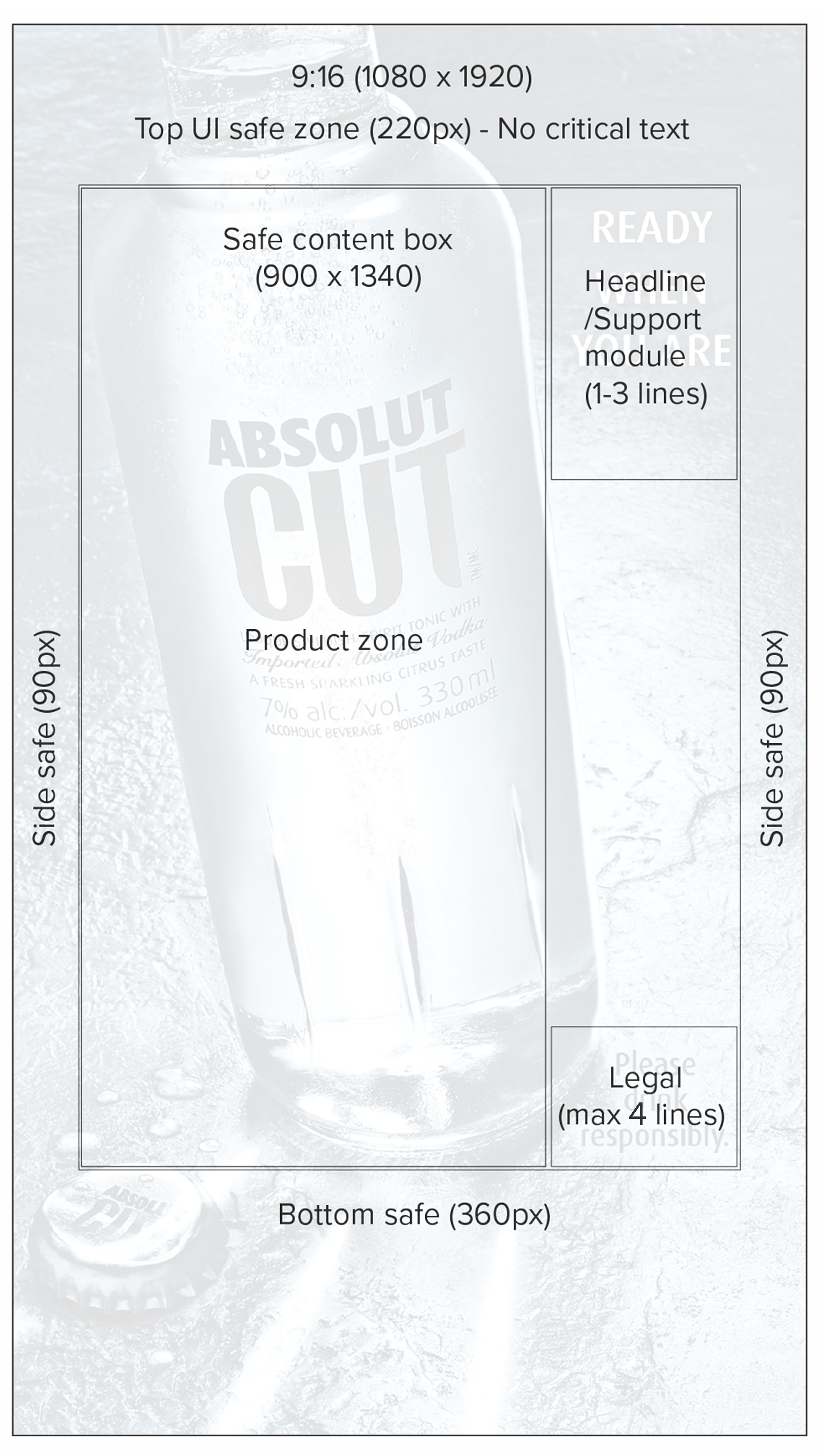
Canvas: 1080×1920
Safe content box: 900 x 1340
Modules: Product left / Type right
Headline: Maximum three lines
Support copy: Maximum three lines
Legal: Compact approved lockup, maximum four lines
Typeface: Dax Pro, selected for compact uppercase readability and continuity with the original campaign.
Motion: Hook → product + support → headline then legal → hold
Craft + Production Rules
These rules preserve product authenticity, brand recognition, and readability across print, motion, social, display, and OOH.
Production Principles
• Preserve the bottle silhouette, label, and CUT mark.
• Maintain the removed-cap and active-carbonation cues.
• Retain the tactile glass, condensation, and surface treatment.
• Keep typography secondary to the product.
• Protect brand and legal readability in every format.
Modular Rollout
One campaign idea. Multiple channel expressions.
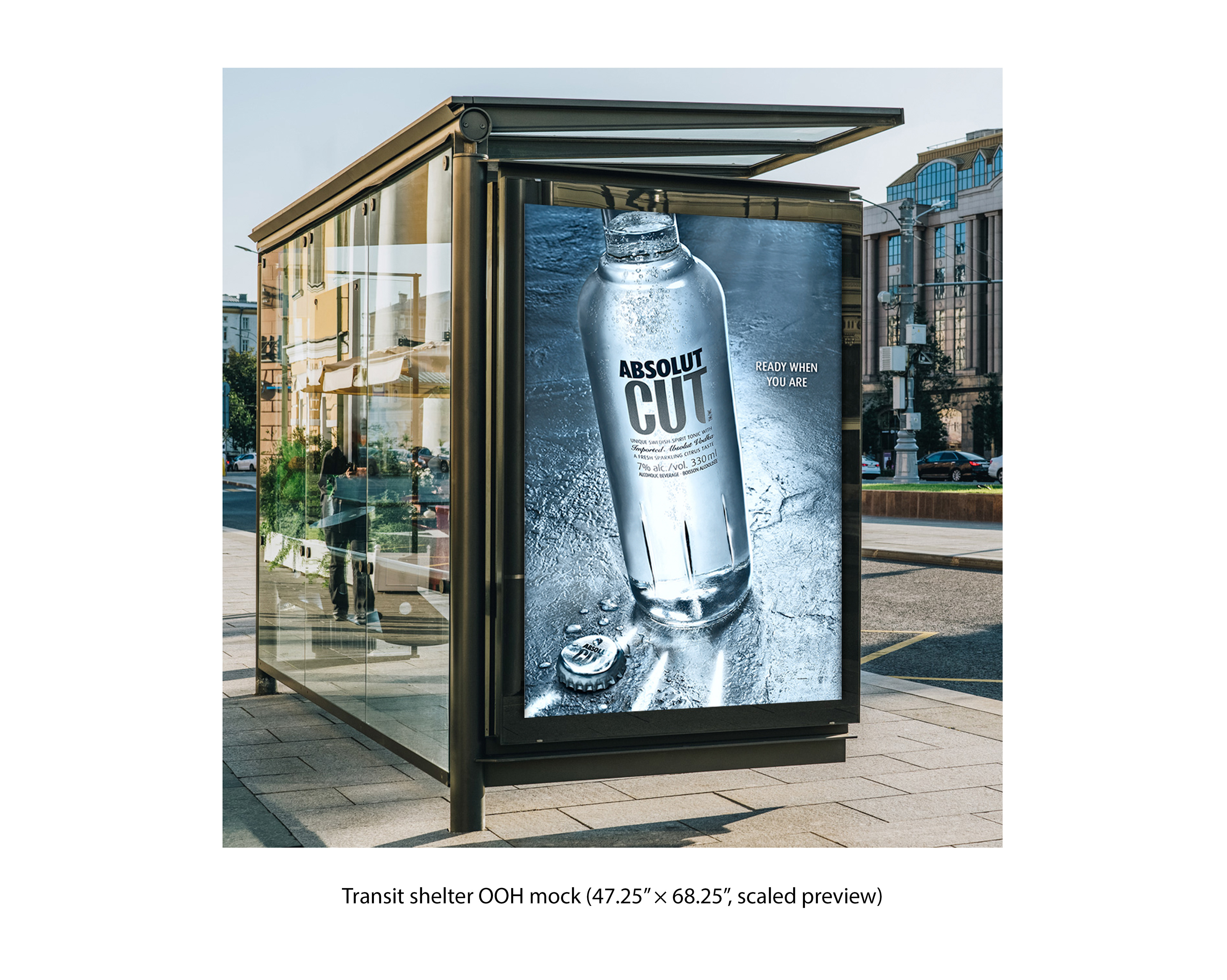
The campaign extends across social, display, video, and OOH while preserving the same product hierarchy and visual identity.
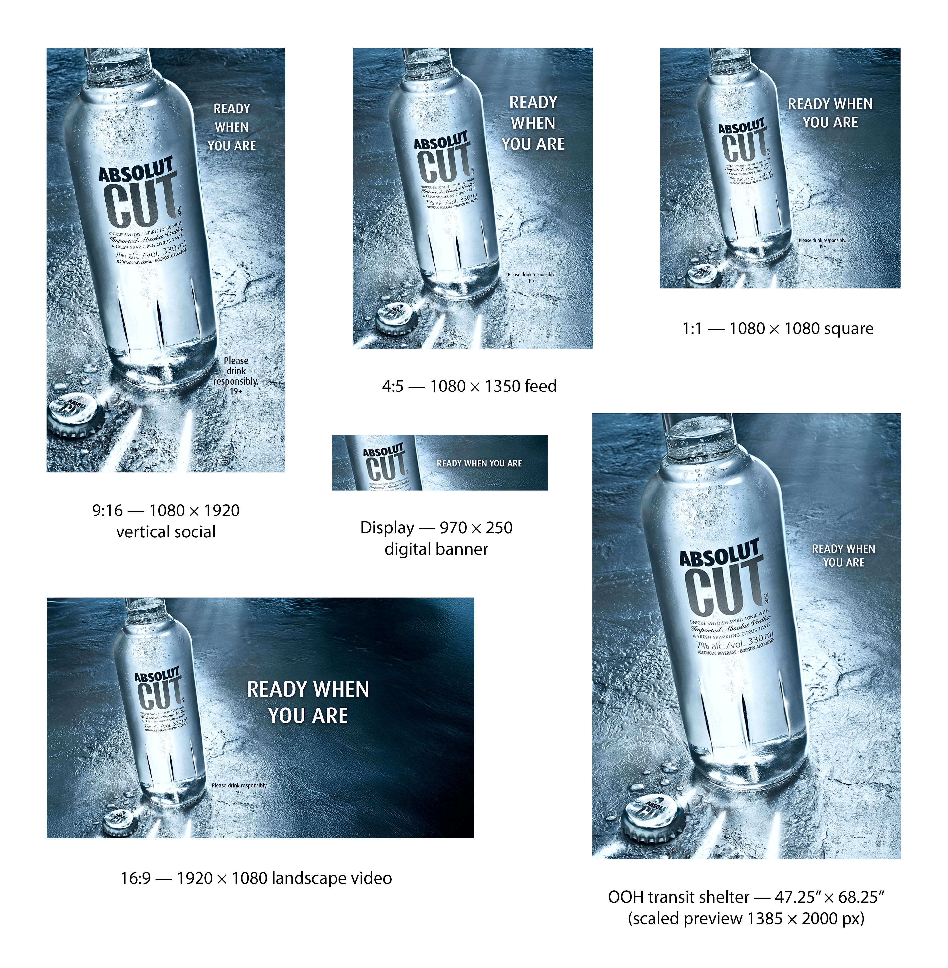
OOH Adaptation — Transit Shelter
Outcome
The original key visual established a premium, product-first expression for Absolut CUT’s Canadian launch. It debuted at the launch event at Toronto’s Distillery District and was produced across OOH, retail POS, and on-premise applications. The event was described as a “universe of sophistication” in an Absolut/V&S corporate press release, a positioning reflected in the campaign’s tactile product photography and restrained brand hierarchy.
The self-initiated contemporary adaptation demonstrates how the same visual idea extends across motion, social, display, and OOH while preserving the campaign’s core identity.